Bhuku

PROJECT OVERVIEW
Challenge:
Bhuku is a book inventory app that was inspired by goodreads.com. They’ve been collecting data on popular books, and hired you to give the app a more user-centric approach, adding features and flows that make it delightful for people to use.
Objectives:
Design a mobile app for Bhuku that is user-friendly and delightful to use
Create a brand for that aligns with Bhuku's values
Role:
UX researcher, UX Designer, Interaction Designer, UI Designer
Tools:
Adobe Illustrator, Adobe XD, Adobe Photoshop
Team:
Self Directed, with guidance from mentor
PROCESS

EMPATHIZE
Process: Secondary Research, Primary Research, and Synthesis.
Bhuku is a book inventory app that was inspired by goodreads.com, an American book cataloguing website and app. To grasp the current state of Bhuku’s market, online research began with an in-depth look at the goodreads’ user demographic, alongside its user engagement patterns.
Predictably, I found that the app’s users primarily consisted of US residents (45.56%) with a strong correlation between education levels and readership (44% of goodreads’ readers had completed college education).
Surprisingly however, I found that the main source of user engagement with the service stems from users actively keeping track of their reading progress in order to fulfill their reading resolutions. In fact, Bookly quotes that “reading trackers” were the number one reason that Americans stay on board with their reading resolutions.
Indeed, a glance at some of Bhuku’s competitors - goodreads, Libib, Library Thing, Litsy, and Kindle - found that while the different apps each had their own unique approach to book cataloguing (some apps emphasize on barcode scanning and others provide a instagram-esque tag system), all of the apps offered highly customizable libraries for users to maintain.
Secondary Research
Assets: Research Plan, Market Research, Competitive Analysis, Provisional Personas
Diving deeper into finding the needs of potential users, I went onto Discord and Slack channels, and found 5 individuals within the Bhuku’s market demographic to further our previous assumptions and validate the secondary research findings.
During the interviews, I asked open ended questions to gain more knowledge about how my participants went about finding, selecting, and reading their novels/novellas; I questioned their process in defining a criteria, their motivators to read, and honed in on how they engage with physical or electronic books.
Once I began seeing significant trends and patterns (over the course of five user interviews), I began to map out interview transcripts with the audio and video recordings I took. These led to the creation of an empathy map that I used to dissect the information from the User interviews, and view them at an atomic level.
Primary Research
Assets: Interview Guide, Research Findings (Observations), Empathy Map, User Persona
After the initial mapping of the transcripts, I began to organize the data based on patterns and trends that I saw in the mass of information.
Empathy Map
Assets: Empathy Map
I identified half a dozen patterns, and picked out 4 categories that had particularly robust support, in terms of statements, to analyze in further detail.

And using the common points that I found in all 4 categories, I compiled a set of key insights that rang true with multiple transcripts across the board.

Meet Lisa. Bhuku’s user represented. Her profile will serve to constantly remind us of the user that we design for, and how we can reach her through her various frustrations, needs, motivations, and goals.
User Persona
Assets: User Persona

DEFINE & IDEATE
Process: POV Statements & HMW Questions • Brainstorming
POV Statements &
HMW Questions
Assets: POV Statements & HMW Questions
Individual Brainstorming
Assets: Brainstorming
The insights I gleaned from the patterns in the Empathy Map were further refined into POV Statements and HMW Questions - a standard practice to narrow the focus of user needs and reposition them into solution-focused questions.
Here, the POV statement honed in on the insight and need I previous derived, and forced them into a congruent statement that lets me perceive it in the context of a whole. Instead of just looking at the fact that “Users feel a sense of achievement by tracking books they’ve previously read” and “Users need a way to track their completed readings,” I combined them into a complete perspective and formulated the question of “How might we help Lisa track her readings?”
And repositioning the problem space in this format allowed me to focus on ideating ideas that directly counteracted the problem of issues regarding music accessibility in that context.
Brainstorming features began with 3 minute mind maps on each HMW questions. The goal was to come up with as many feature solutions as I could to tackle each HMW. I performed a total of 6 mind maps (2 per HMW question) over the course of 2 rounds; the initial mind maps were fairly difficult because of the limitations of the game. Since it wasn’t yet developed, I couldn’t approach it with traditional features that work for other existing games.
Nonetheless, the session helped me generate a core group of features that I later fleshed out, and contributed greatly to my feature roadmap.
STRATEGY & INFORMATION ARCHITECTURE
Process: Business & User Goals • Product Feature Roadmap • Sitemap
Before I began the Interaction Design portion of my process, I first needed clear and concise definitions of the Business and User goals, along with prominent technical considerations that may come into play. These goals will establish a criteria of what my design will accomplish, what features I must incorporate into the design, and a priority list of which features are the most important, and those that are not necessarily needed.
Business and User Goals
Assets: Business & User Goals

Having defined the various user and business goals, I further filtered my list of features with these goals as the criterion.
The features were then reorganized into a priority-based list in accordance with the following metrics: user goals, business goals, effort level (needed to create the feature), and confidence level (how much assurance I had in creating the feature).
In the final iteration of the feature list, it showcases a list of high-priority features necessary to solve the problem and conform to the criteria, along with the middling and low priority features that can be incorporated given enough time and budget.
Product Feature Roadmap & Sitemap
Assets: Product Feature Roadmap, Sitemap
INTERACTION DESIGN
Process: UI Requirements • Task Flows • User Flows • Low-Fidelity Sketches • Mid-Fidelity Wireframes
I created 3 basic task flows that outlined the most important elements of the new features and the problems they were trying to solve.
For each of these tasks, I outlined the high level requirement of each screen that needed to be created, and a detailed requirement of how each feature would operate. This became the foundation for the design of my new features.
UI Requirements
Assets: UI Requirement Document
With the 3 critical user stories established in my UI requirements document, I mapped out different routes that could lead the user to perform a task from start to finish. This begins from the moment they open the Bhuku app and ends when they close out of the app.
Task & User Flows
Assets: Task Flow Diagram, User Flow Diagram

The task flow outlines how the user would approach the tasks outlined in the UI Requirements Document, namely to gauge a novel’s ratings before committing to a purchase.
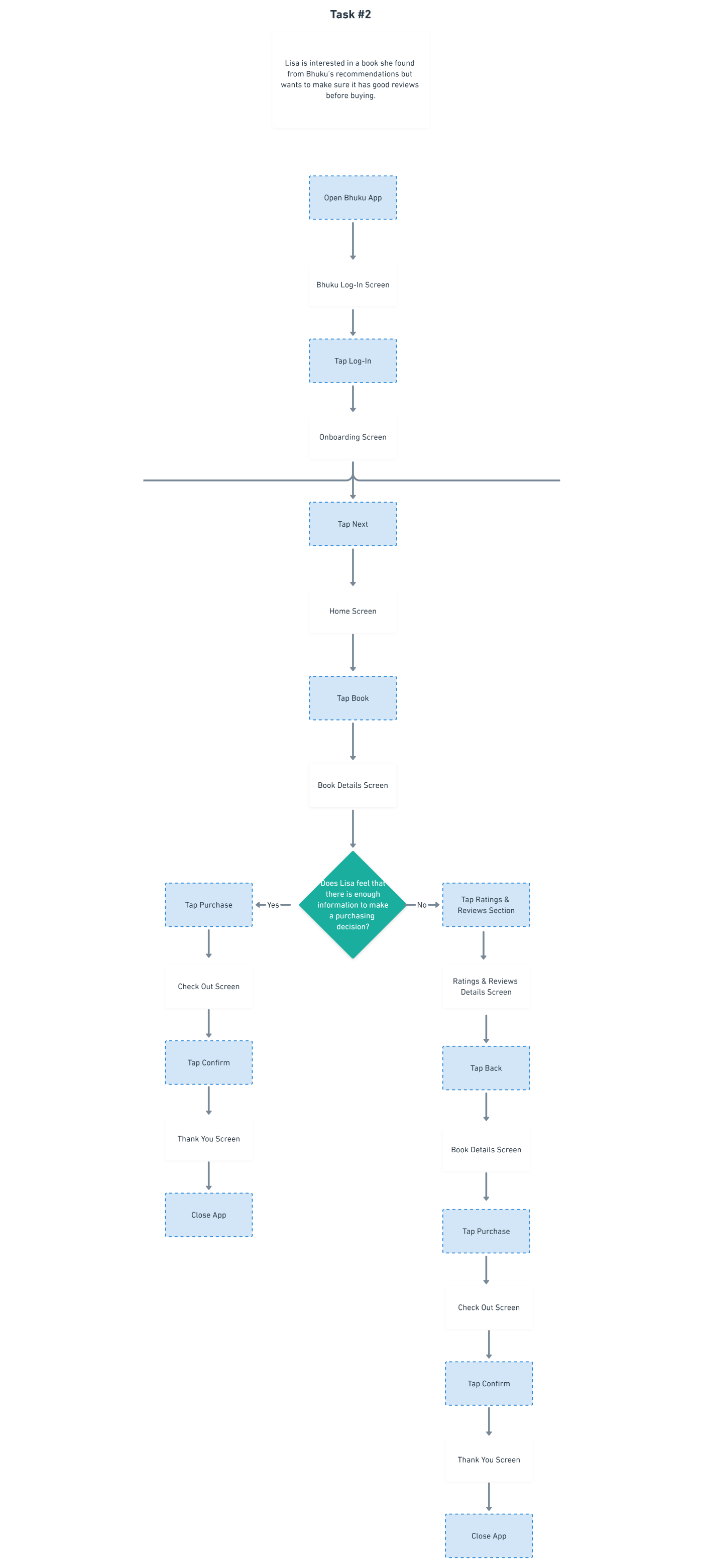
In the User Flow, I took a look at the different decisions that users will face during the course of their task flow. The diamonds represent key choices that Users will face, and ultimately lead to different sets of actions.
Guided by the Business & User Goals, Product Features Roadmap, the Task Flow, and the User Flow, I began sketching out possible home screens for Bhuku’s app design. Each sketch focuses on a different approach to providing quality indicators to the user.
Low Fidelity Sketches
Assets: Low-fi Sketches (Mobile)

I re-evaluated my sketches, chose the one that best fit my defined criteria, and went onward to create mid-fidelity wireframes using design principles and Human Interface Guidelines as the basis.
Mid-Fidelity Wireframes
Assets: Mid-Fi Wireframes (Mobile)

PROTOTYPING & USABILITY TESTING
Process: Mid Fidelity Prototype • Usability Testing Plan • Usability Test Notes • Affinity Map
The mid-fidelity wireframes were refined further, and used to create a prototype that outlined my three user stories, allowing me to test the effectiveness and efficacy of the designs.
In preparation for usability testing, I created a usability testing plan that outlined 3 scenarios and various tasks that would allow me to test the effectiveness and efficiency of the designs.
Prototype & Usability Testing
The affinity map gave me insight into common frustrations and pain points that the users experienced, and better informed my revisions as I began revising my design to alleviate these issues.
Affinity Map & Recommendations
Assets: Affinity Map
Affinity mapping allowed me to pinpoint several areas of concern: 1) Onboarding Behavior, 2) Confusion with Terminology, 3) Reliance on the Library Main Screen to Navigate. To mitigate these concerns, I made a list of actionable design recommendations to resolve these issues.

I executed the design recommendations and adjusted my mid-fi prototype to show these changes before moving into hi-fi.
USER INTERFACE DESIGN
Process: Brand Logo & Style Tile • UI Kit • High Fidelity Wireframes & Prototype
With the layout of the app revised and finalized, I began work on Bhuku’s branding and UI. First I created a mind map of Bhuku’s brand, to come up with a set of adjectives that could help guide the branding process.
After I came up with the adjectives, I began to build an inspirational mood board for the brand’s Colour, Typography, Posters, Logos, and Imagery. These gave me the ideas I needed to start sketching my logo, and picking the colours and fonts. Eventually compiling into the Style Tile below.
Style Tile
Assets: Style Tile

After the Style Tile was compiled, I applied the style throughout the prototype to create the high fidelity version of Bhuku’s app.
High Fidelity Wireframes
Assets: High Fidelity Wireframes

Refinements into the UI of the design finally brought my UI Kit, which was a living document that constantly changed with every iteration of the site, closure. The finalized colours, typography, and style were rearranged into their atomic and molecular forms, and put together in a cohesive document.
UI Kit
Assets: High Fidelity Wireframes

The next step would be to formally hand off the assets to the client or developer. This would be followed by continued testing of the design updates since the last usability testing, update the UI Kit, and continuously cycle through iterations and testing for as long as resources allow.
Iteration

Reflection
Designing Bhuku’s screens and brand were challenging because of the many existing apps in existence. Each competitor had it’s own unique approach to managing book inventories, and it was difficult to find a set of existing design patterns.
Because the research was performed under the influence of a Global Pandemic as well, statistics vary from previous years, and reader behavior has changed dramatically from previous studies.
The result was that the research phase was much more intensive than I had originally anticipated, but much more rewarding in turn.